Compare your current prices with the average prices in the market
In the product overview you can see the price ratio graph. This graph shows how your products are priced compared to the market average.
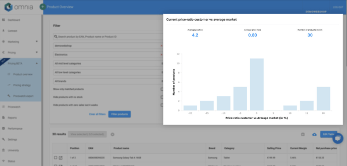
The separate bars show the number of products that represent a certain price ratio. By clicking on these bars, you can drill down and filter a specific selection of articles.
Bar graphs skewed to the right show your articles are overpriced compared to the market average. Left-skewed graphs indicate that your prices are relatively low to competitors.
Average position
A price position is where an article sits in the market based on price alone.
You can strategically manipulate your pricing to achieve different price positions. Some shops might want to always have the lowest price for products, while others might want to have higher prices.
In the Omnia portal, you can see the average price position for the selection of articles filtered. This number shows you how your prices are ranked compared to competitors.
Average price ratio
The price ratio is defined as the price of an article divided by the average market price of that article. An average price ratio below 1 indicates that your prices are lower than the market average, whereas a price ratio above 1 indicates that your prices are higher than the market average.
In Omnia, you can see the price ratio for the selection of filtered articles at the top of the price ratio graph.
Number of products shown
This number shows the quantity of articles that are currently selected by the filter. Both the numbers and the bars in the graph are calculated based on these selected articles.